
How to build a Google Data Studio Dashboard

Step 1: Login & Create A Blank Report
The first step is to visit datastudio.google.com and sign in with the account that is the same account as the Google Analytics & Google Search Console you want to create the dashboard for.
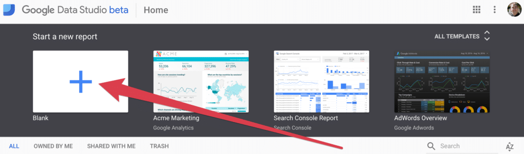
Once you have signed in and accepted any Terms of Service notices, we are now ready to create our blank report. Simply click on “+” for the “Blank” report template. There are other pre-built templates you can check out, however, for this tutorial, we are going to create a new blank report.
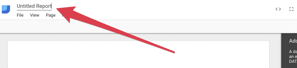
Finally, let’s rename this dashboard so it is easy to find. This is an important step. Google will auto-save your dashboard as you go, however, if you leave the name as the default, it will be difficult to find later.
Step 2: Add Your First Data Source
For this dashboard, we will need two data sources. We will need to connect to Google Analytics & Google Search Console.
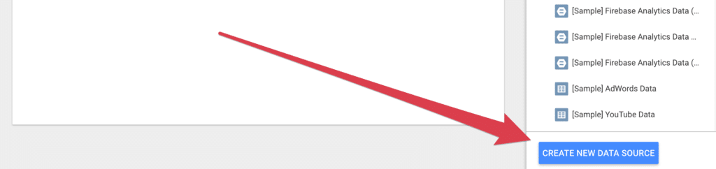
First, click the “Create New Data Source” button.
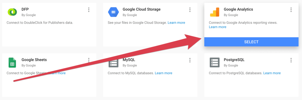
Next, find the Google Analytics connector and select Google Analytics. You will notice there are many other connectors you can choose from. These are all the different data sources that can be pulled into a report. For now, let’s stick to our current dashboard.
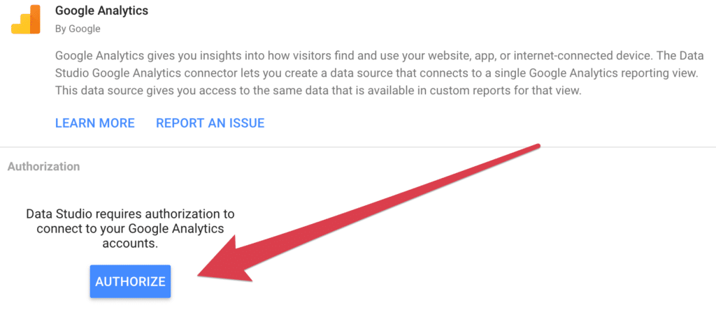
We now need to authorize our connection to Google Analytics. You will need to select “Allow Access” on the authorization popup that follows.
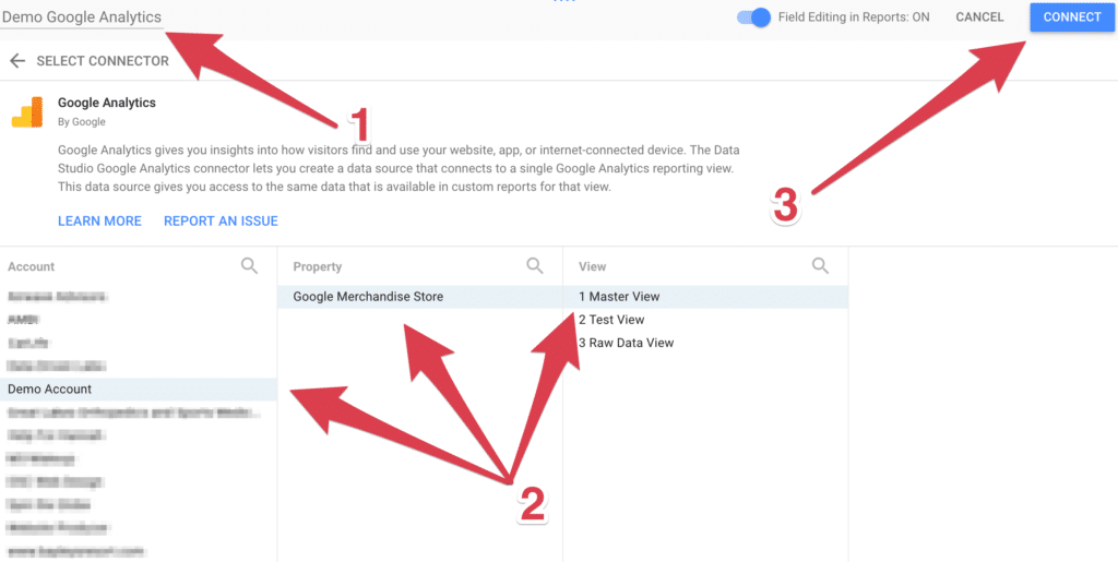
Our next step is to rename this connector to make it easier to find. In this example, “Demo Google Analytics” is being used. (See #1)
Now we must choose our Google Analytics account, then the property followed by the view. This should be your main view that you use when viewing your data in Google Analytics. (See #2)
To finish this step, click the connect button to connect to this data source. (See #3)
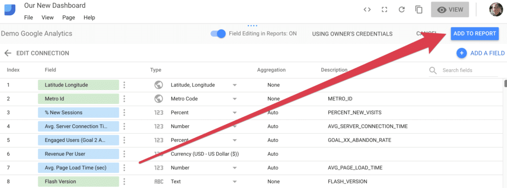
The final stage to adding the data source is to click “Add to Report”. At this state, you are able to modify fields and add calculated fields if needed. This is more advanced and will be covered in a later article. For now, all the fields are setup perfectly fine for our dashboard.
Step 3: Add Your Second Data Source
Now that we have already added one data source, the screen has changed and we no longer have the “Create Data Source” button in the lower right of the screen. To add a second data source, we will need to go to “Resource” and select “Manage added data sources”.
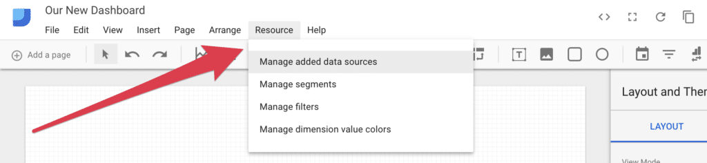
This is the panel where you can manage your data sources for each report/dashboard. You will see our first data source we added. To add a second, just click on “Add A Data Source”.

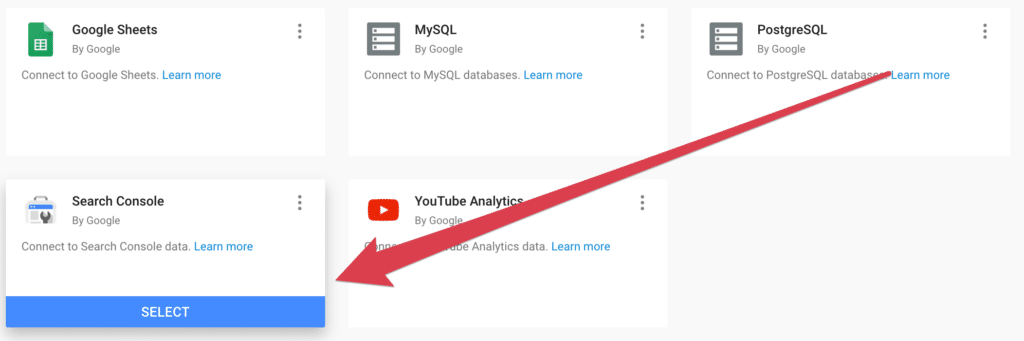
This will take you back to the connector gallery. Simply find the “Search Console” connector and select it. You may need to authorize once again.
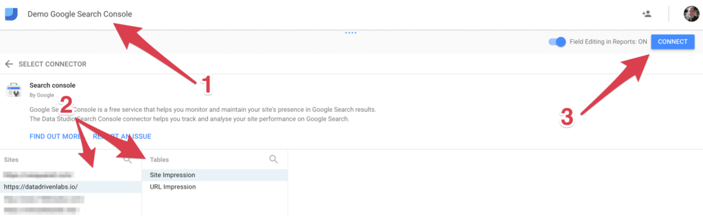
As we did before, rename this data source to something you can identify easily later. (See #1)
Next, select your site and for this dashboard we are going to focus on “Site Impression” table.
Finally, click the connect button to connect this to your dashboard.
Step 4: Adding Elements
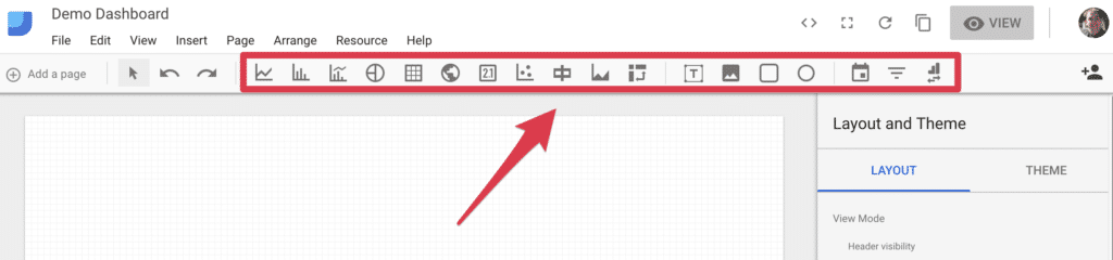
Now that we have setup all our data sources, it’s time to build out our dashboard. Google Data Studio comes with several types of elements that can be added to your report. These elements include line graphs, pie charts, tables, geo maps, scorecards and many more.
Line Graphs / Time Series
Our first element we want to add to our dashboard is a time series line graph. This will allow us to visualize our traffic over time. To do this, simply click on the time series element from the menu and drag out a graph to take up the top left half of our dashboard.
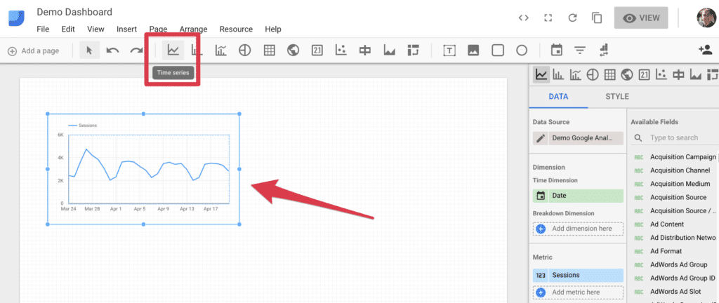
Once you add this graph, we need to select our data source, dimensions and metrics.
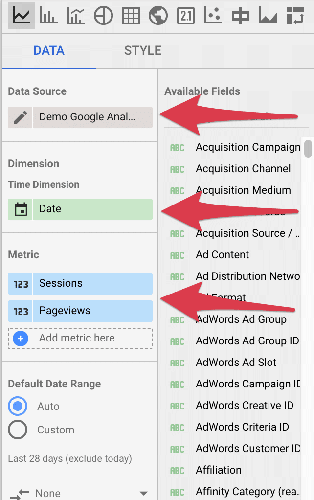
First, we will want to select the correct data source. Because the last data source we added was search console, your graph may default to that data source. To change this simply select the edit button next to the data source in the panel to the right of your dashboard. Pick the data source that you set to Google Analytics in step 3.
For our time dimension, we will want to break this out by date. There are many options you can choose from, feel free to browse other options. For this example dashboard we will use “Date”.
With this type of graph, you can have multiple metrics which will show up as different colored lines on the line graph. For this example, we want to pick “Sessions” and “Pageviews”.
As you pick these dimensions, pay attention to the line graph in your dashboard. Your graph will update to reflect your changes immediately.
Pie Charts
Next, lets create a pie chart to visualize our acquisition channels. Select the pie chart element from the menu and add it into the blank space next to our line graph we added previously.
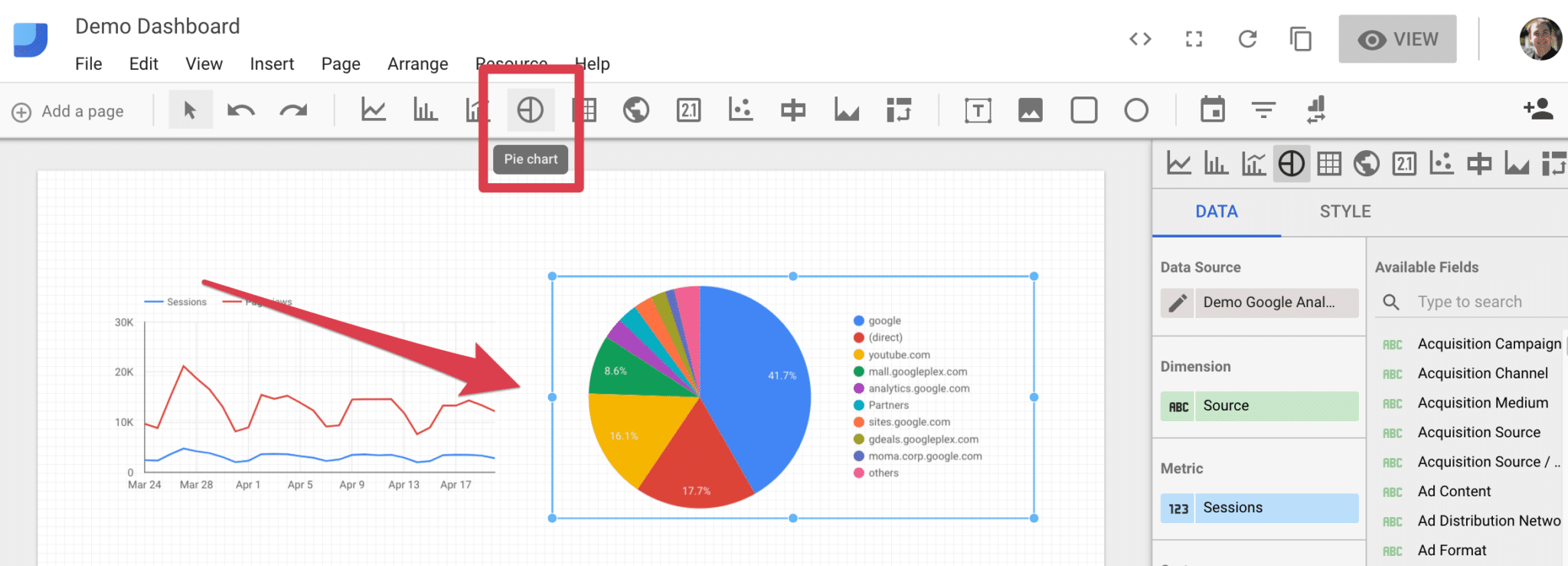
When you add your pie chart, it will pull in default dimensions and metrics. We will want to update these to reflect our acquisition channels. Simply change the dimension to “Default Channel Grouping” and your metric to “Sessions”.
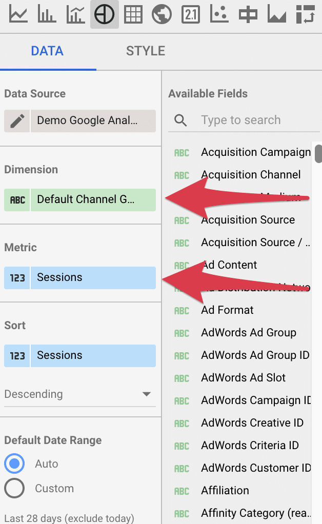
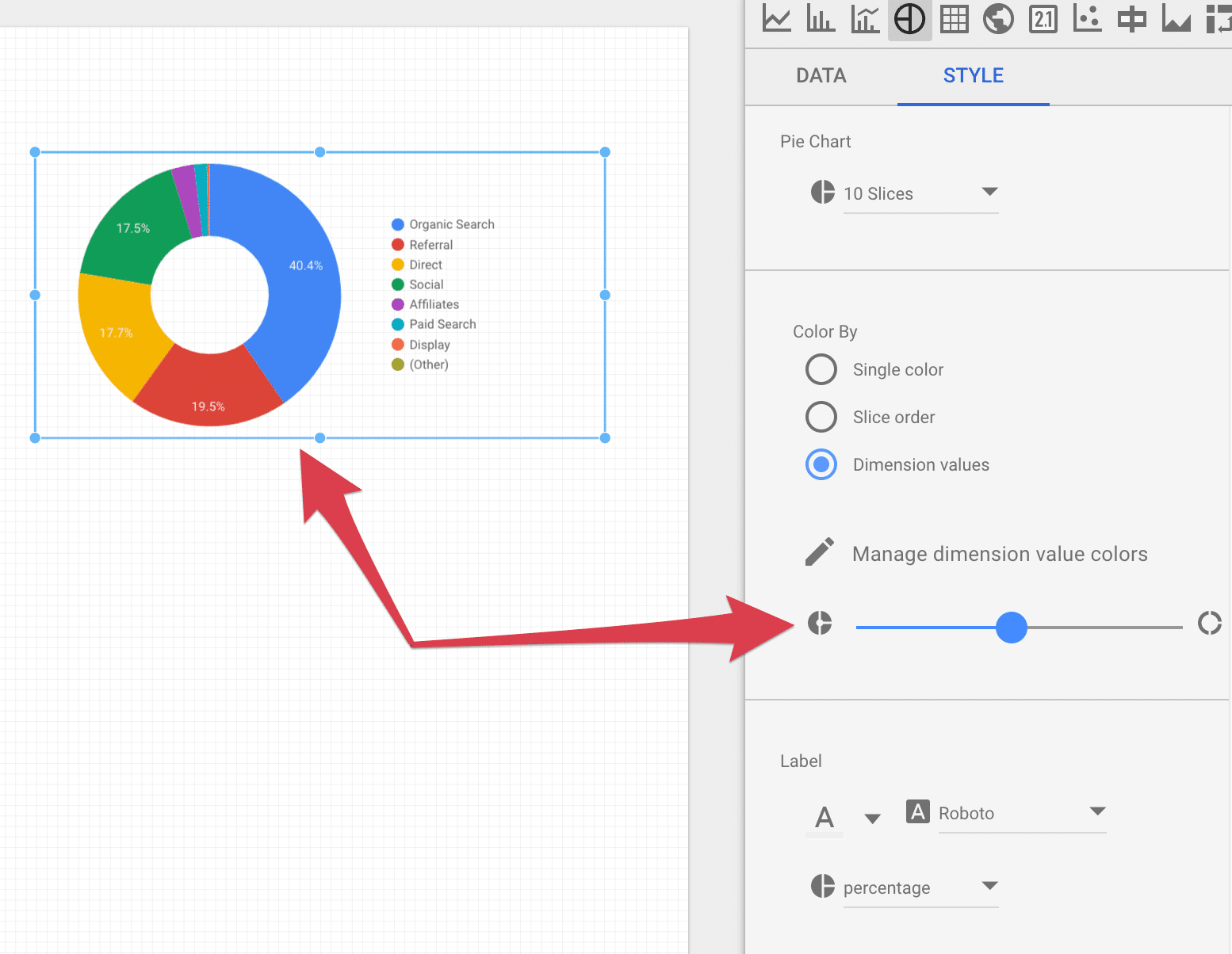
You can also play with the styles for any element you add to the dashboard. Simply switch from the “Data” tab to the “Style” tab.
For this example, we changed the pie chart to have a “hole” in the middle. Feel free to style your elements however you feel fits best. You can edit colors, text, labels and much more.
Scorecards
Scorecards are a powerful element that allows us to present raw metrics. For this example, let’s add a scorecard element under our line graph.
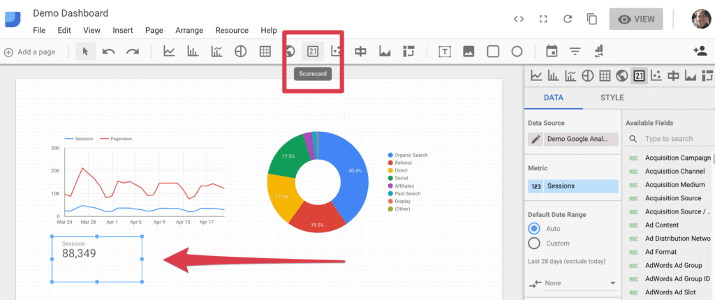
For this scorecard, we want to measure sessions. Simple select the “Sessions” metric.
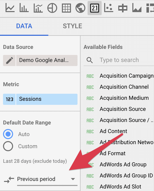
Often, your stakeholders will want to compare this metric to previous time periods. With the scorecard, we are able to easily add a comparison by selecting previous period. This will show what percentage increase/decrease you had from the previous period.
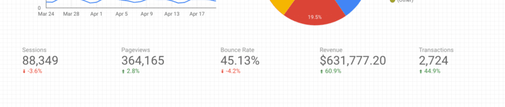
One scorecard may not be enough. Add additional scorecards for different metrics you want to track. For the dashboard, we used Sessions, Pageviews, Bounce Rate, Revenue and Transactions.
Note: You can speed up the process by setting up your first scorecard, styling it and then copy/paste the additional scorecards. You can then quickly change the metric on each of these scorecards and have a much more uniform look.
Tables
Tables are a great way to embed lists of data. Tables are scrollable and also allow for pagination. For our dashboard, let’s add a table that takes up about two-thirds of the screen.
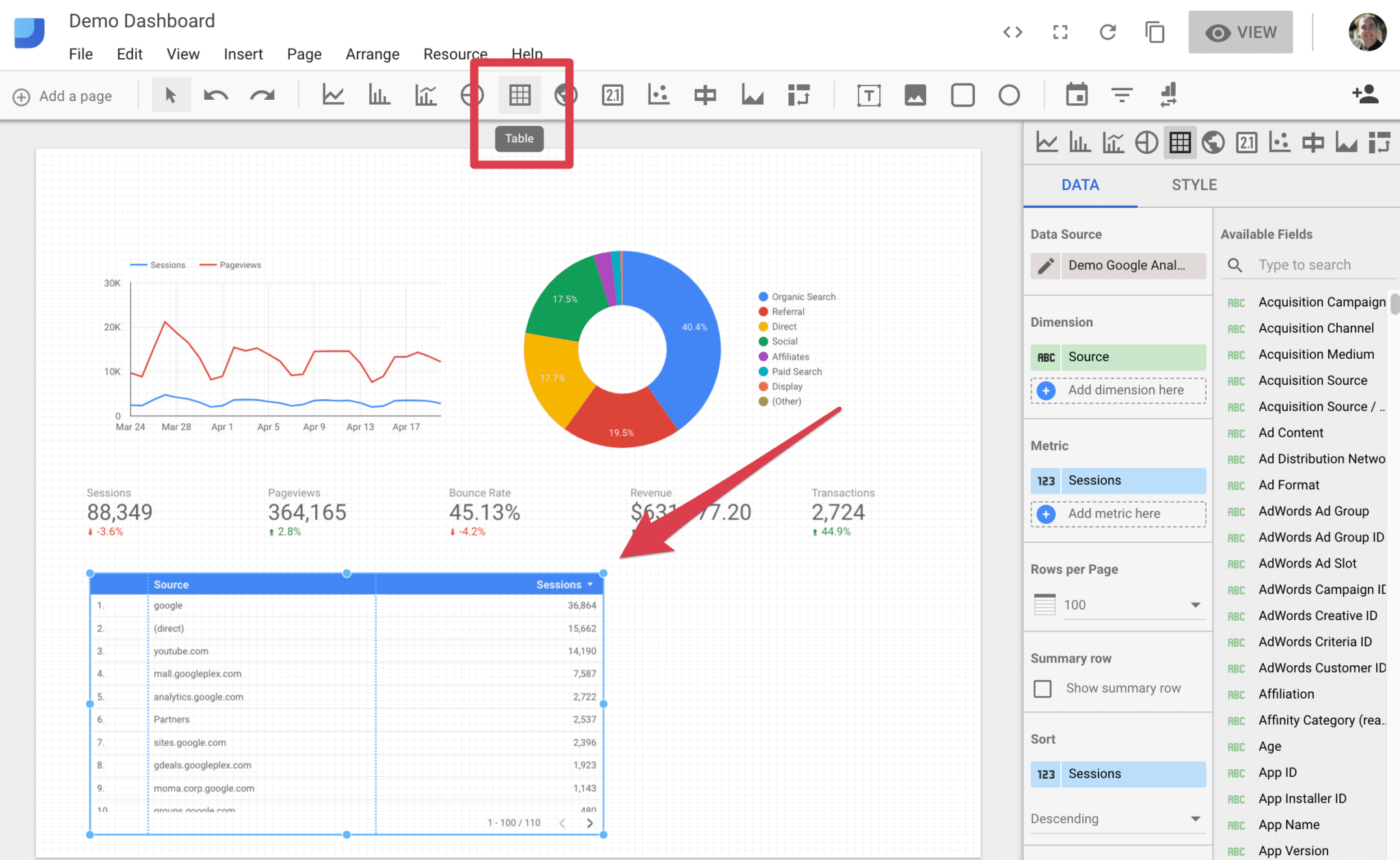
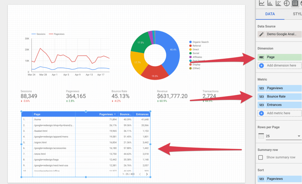
For our table, we want to display our pages in order of top pageviews and also show us the number of pageviews, entrances and bounce rate percentage.
Set the dimension to “Page” and add “Pageviews”, “Bounce Rate” and “Entrances” as metrics. Your table should update immediately. You may need adjust each column width.
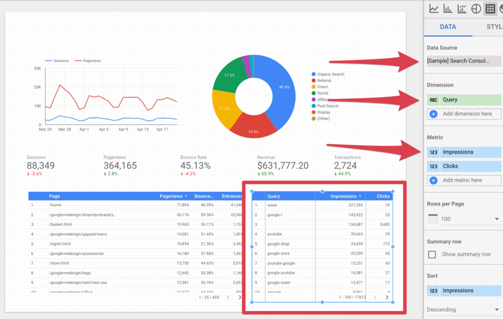
The final element we want to add to our dashboard is a table that pulls queries from Google Search Console.
Simply add a table to the right of our previous table. Set the data source to be your Google Search Console data source we setup earlier. Next, select “Query” as our dimension. For metrics, let’s add “Impressions” and “Clicks”.
Step 5: Adding Date Range Filter
Currently, all the elements added to our dashboard are set to pull “Auto” as our date. By default this is pulling the last 28 days, but, what if you wanted to view a different date range?
Google Data Studio as an element known as a “Date Range” filter. This is added the same way as all other elements. Just select it from the menu bar and drag out a date range filter at an appropriate size.
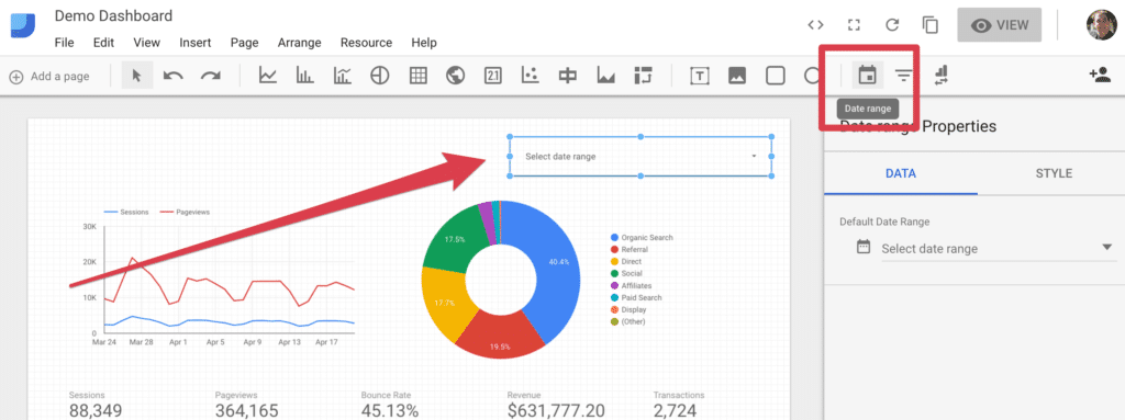
Once you add the filter, switch over to view mode and try it out. This allows you to select a date range for your dashboard.
If you have any comparison elements set to the previous period, such as our scorecards, they will compare whatever date range you select to the previous period. For example, if your date range has 45 days in it, the comparison will be the 45 days prior to that range.
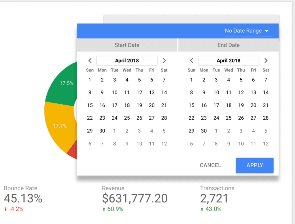
You can also set a default date range on the “Data” tab for this date select. Often, I will set this to the last 30 days. You can also switch over to the “Style” tab to update the look of the date selector popup.
Step 6: Add Text Headers & Images
Once elements have been added, you may have noticed that there are no headings. This can be confusing to anyone using your dashboard. Also, we may want to add some branding or images to help others make better sense of our newly created dashboard.
Text Headers
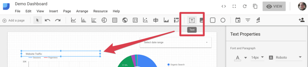
Google Data Studio makes adding text headers very simple with their “Text” element. Simply drag out a text box and add your text. Under text properties, update the size, color, and font-weight to achieve your desired look.
Adding Images
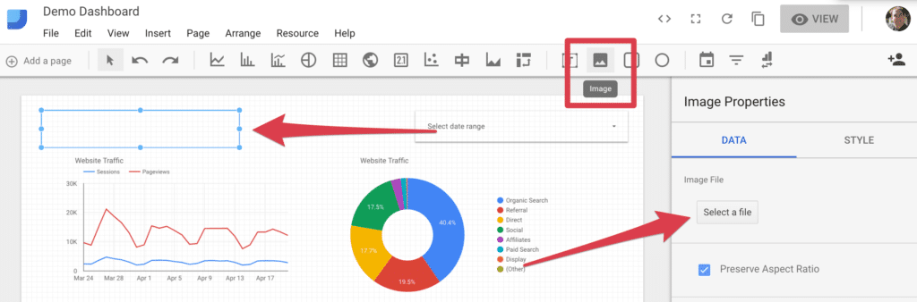
There are several reasons as to why you may want to add images to your dashboard. The most common is to add your company’s branding.
Select the image element from the menu bar, drag a box onto your dashboard then click on “select a file” button on your “Data” tab. Browse you computer and find the image file you want to add.


Comments
Post a Comment